Brand Guide
The guidelines document was only the start. I designed every item inside it as a real item: stationery, email signatures, a custom icon library, the website, large-format print, and a full wayfinding system.
Branding * Full brand guideline * Wayfinding * Website Design * Digital * Email * Presentation Design * Large Format Design * Internal Coms * Stationary Design

Purpose:
Brand Guide
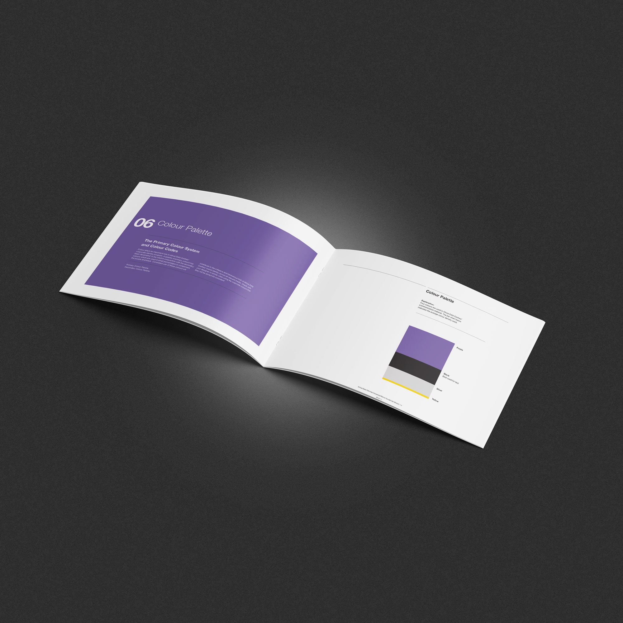
The brief was to create a unique visual identity for a data centre and a brand guide. The logo had been designed, and the only rules for the brand were the 4 colors specified, the font Helvetica Neue, and that no pink or blue was to be used. I developed and designed the brand guide and also created icons representing their services. I designed their signage and wayfinding, website, brochures, internal docs, SharePoint, and email signatures.

Process:
When I first started working on the brand, there were few images of data centers, and due to security concerns and the COVID lockdown, I was reduced to using stock images. The pool of images at the time was very limited, so the decent stock shots were overused by other data centres and web hosts. Plus, most pics of data servers or racks always had either a pink or blue glow, which were 2 colors I was explicitly NOT allowed to use. To overcome the limitation, I developed a color grading look that used 3 of the brand colours and not only made the stock shots look unique but also made it hard for anyone else to use or copy them, as the colour was the signature.
As the brand grew, I created a one-page brand snapshot that was easy to understand as it contained the basic items - logo usage on different colours, the official colour swatches and fonts, as well as a mini mood board of the current campaign.


Brand Guide
The guidelines document was only the start. I designed every item inside it as a real item: stationery, email signatures, a custom icon library, the website, large-format print, and a full wayfinding system.

Brand Guide
The guidelines document was only the start. I designed every item inside it as a real item: stationery, email signatures, a custom icon library, the website, large-format print, and a full wayfinding system.

Brand Guide
The guidelines document was only the start. I designed every item inside it as a real item: stationery, email signatures, a custom icon library, the website, large-format print, and a full wayfinding system.

Brand Guide
The guidelines document was only the start. I designed every item inside it as a real item: stationery, email signatures, a custom icon library, the website, large-format print, and a full wayfinding system.

Brand Guide
The guidelines document was only the start. I designed every item inside it as a real item: stationery, email signatures, a custom icon library, the website, large-format print, and a full wayfinding system.
Proof:
The brand guide has been in use since 2021. Since I work across multiple platforms/apps, I also created an easy-to-use HTML brand guide that’s easy to copy and paste from.
I've had custodianship of the brand for 6 years and have effectively used the guidelines and colour as a visual identifier in slide decks and on the new website.
I've also created 3 different color themes (dark, light and purple) for social media and ad banners to prevent banner blindness and to also introduce variety.
Other projects

Data Centre Launch
15+ touchpoints: banners, backdrop, signage, invitations, branded snacks and bottles, slide deck, virtual business cards, and press graphics.

eNPS Mailer
Internal Mailer: eNPS moved from 42% to 92% within 24 hours

HSE
Visual Safety Communication: Safety campaign designed for a multilingual workforce. A custom pictogram system communicates hazards and procedures without relying on text, supported by outdoor signage and promotional items.

Community Badges
Award & Trust Seal Design: Badge system that's collectible, credible, and flexible enough to live anywhere from a website footer to a printed box.

Going for Gold
Event identity & collateral: A conference, branded end to end.